
By Rachel Smith
Remember the good old days of transportation yore, when Muni passes were multicolored and had that trippy, shiny lettering and a font that looked like it came straight out of the credits of some movie from the ’70s? Yeah, those were good days. Muni passes were so damn cool, in fact, that there were T-shirts with the passes displayed across the front in a solitaire-like array. People even collected the passes, showing pride in a system that rarely — if ever — garners pride from its patrons.
Fast-forward to June 2010, when a big ol’ party pooper (a.k.a. the Metropolitan Transportation Commission) swept in and decided that Muni (and BART) passes needed to change. With that decision, a new pass was born — the Clipper card. At first, the change in design was downright confusing, and one couldn’t help but think that the card had possibly been designed by, well, a child. I remember people asking, “What IS this?” and “Is this the beta version?” Even the astute paused in confusion: “Ohhh … I get it. The triangles are the sails of a clipper ship. Wait, what?”
Fast-forward again to 2013, when Rachel Smith, a local arts instructor, had been teaching graphic design to students in the UC Berkeley Extension program in downtown San Francisco. She’d been commuting by train every day into the city and, like all other transbay commuters, she found herself in transportation hell on July 1, 2013, when BART workers went on strike and traffic jams made getting into the city nearly impossible. At around the same time, she and her students had been lamenting the temporary closure of SFMOMA, which had been a valuable site for student field trips. Juxtaposing these two sources of woe, Smith created the Clipper Card Project, which she incorporated into her classes with the following (fictional) creative brief: “The San Francisco Museum of Modern Art, which is currently closed until 2016 for a remodel, is partnering with the SFMTA to create commemorative Clipper cards for their grand reopening.” The one stipulation of the project: students had to draw inspiration from a particular era of design history.
The result was the Modern Museum of Clipper Cards, a blog featuring student work from Smith’s classes at UC Berkeley Extension and the arts program at Solano Community College. As Smith describes it, “The blog is an homage to my students’ amazing work in their graphic-design classes, a celebration of art and design history, and part of a larger vision to incorporate art into our daily lives.” Below are 13 designs from the museum, accompanied by each artist’s inspiration for the design. Check out the blog for more designs from the project, which Smith has been assigning since 2013.
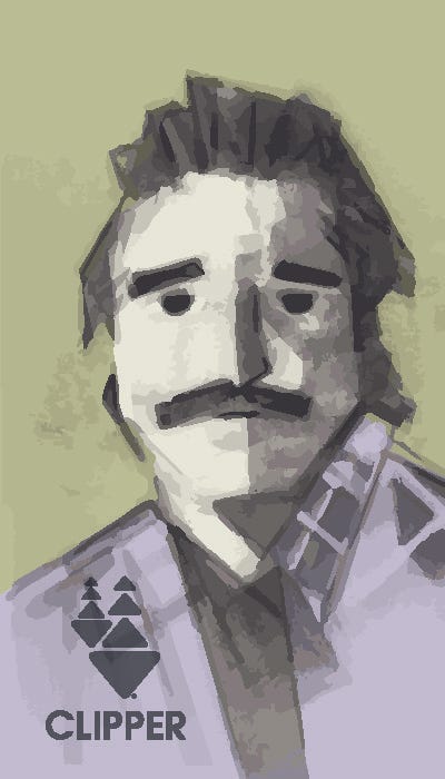
By Tsukin Walter
“I chose the Cubism movement. For me, it was just a fun experiment with a style that appeals to me. I based it off of a photo of Bill Murray with a moustache.”
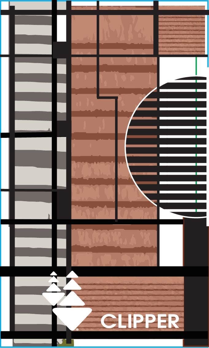
By Mary McCarthy
“The design was inspired by Mario Botta’s iconic SFMOMA building — its colors, geometry and sophisticated interplay of scales.”
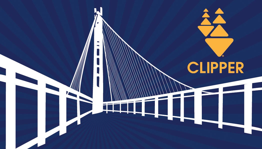
By Irene Amuyunzu
“I love the Golden Gate Bridge. It was one of the first places I visited when I moved to California. I tried to incorporate William H. Bradley’s style into my composition.”
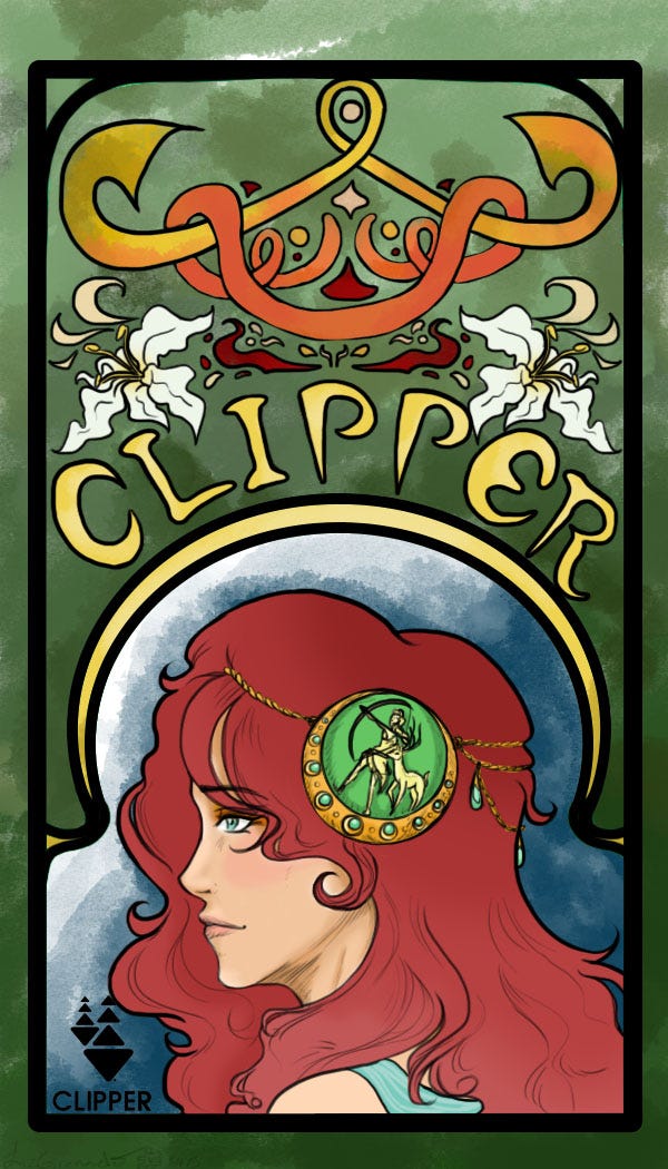
By Liz Granado
“I was inspired by the Art Nouveau movement and the contrast of soft color shading with bold lines. San Francisco’s combination of old and new really drove many of the choices in this piece.”
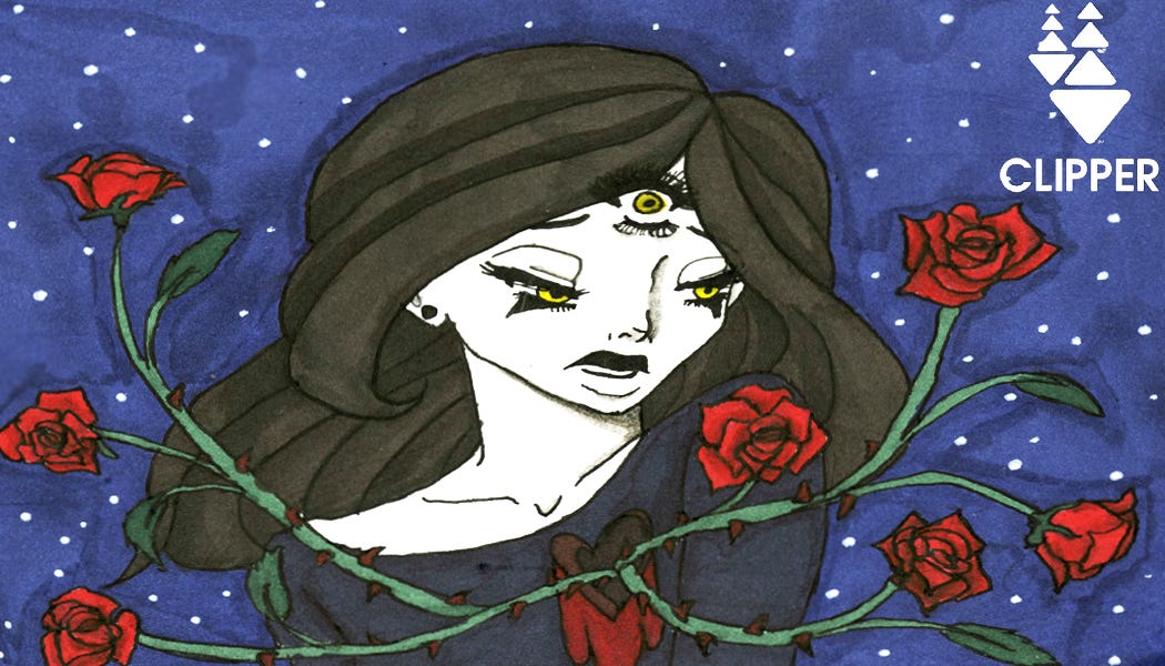
By Channing Elliott
“These designs where heavily inspired by some precognitive dreams that I had when I was younger. These dreams have really impacted my creativity, and I often use them for inspiration in my creative projects. I decided to focus on the art period of Surrealism for these designs, which I feel match the presaged madness of my dreams fittingly.”
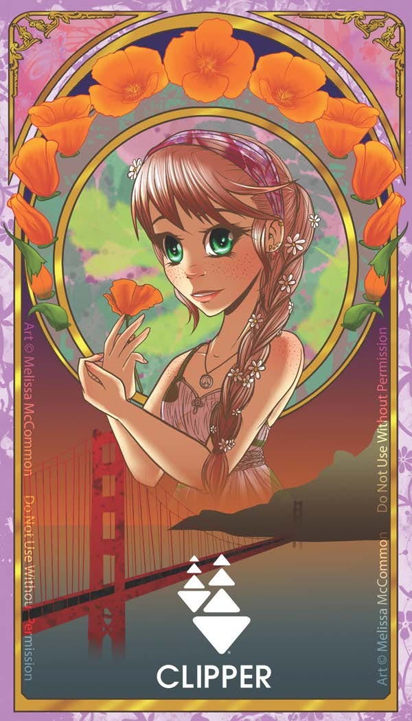
By Melissa McCommon
“I based my Clipper card on the flower-child hippies who were very prominent in San Francisco in the ’60s. I love drawing flowers, so I decided on the California poppy as an accent piece. The card is based on the Art Nouveau period, which I like because of the delicate nature of the pieces that artists like Alphonse Mucha produced during the movement.”
By Jacob Buensalida
“Out of all the design philosophies we researched, my favorite was Art Deco. Art Deco’s patterns and style reminded me of The Great Gatsby. I designed a Clipper card that is heavily influenced by the Art Deco style.”
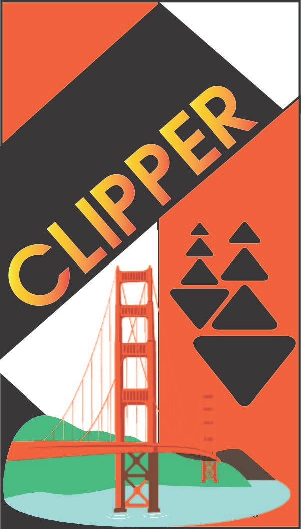
By Cynthia Garcia
“My Clipper card design was inspired by the Art Deco era. I wanted to bring in the bold colors, geometric lines and modernity of that style to my card design. I used the Clipper card brand colors and a photograph of the new span of the Bay Bridge to create my design.”
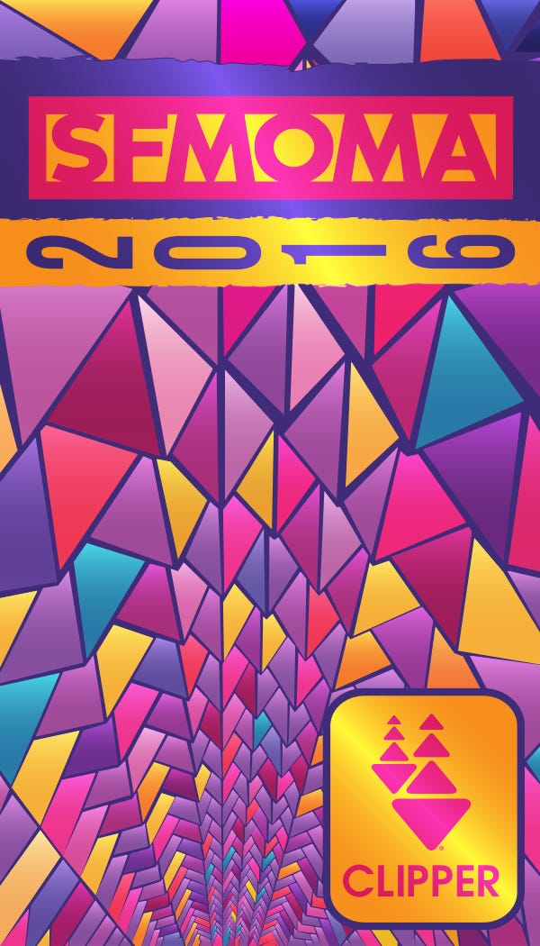
By Sean McCord
“The inspiration for this design comes directly from Olafur Eliasson’s ‘One-Way Color Tunnel.’ The intensely saturated colors and receding geometric shapes create a strikingly modern and beautiful combination that caught my eye.”
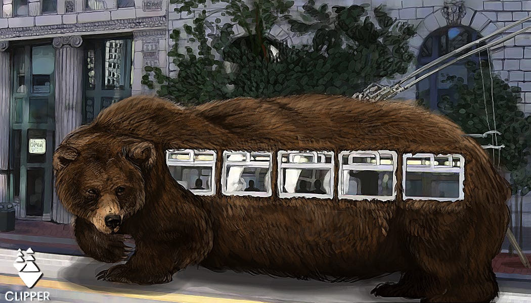
By Kaylani Fuller
“My design is Surrealism mixed in with the mundane 21st century. I really enjoy taking the Muni because it looks really scenic. It’s pretty fast! When I ride it, I feel like I’m riding some type of weird California creature.”
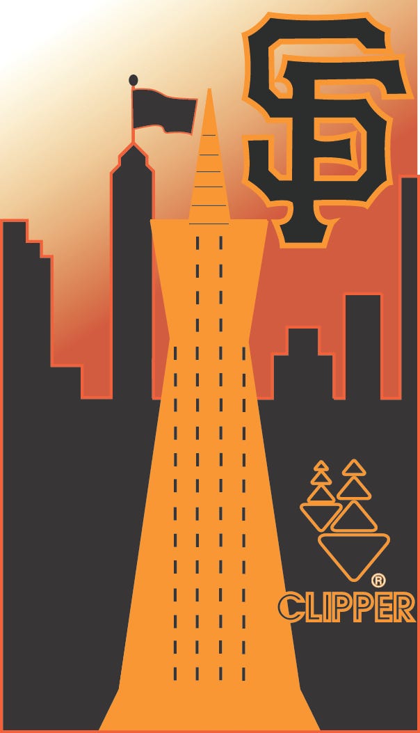
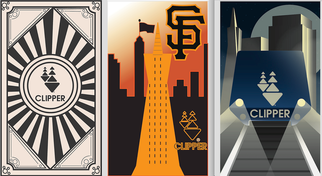
By James Dowling
“I based my Clipper card on the style of Art Deco. To me, this design represents the everyday lifestyle of those who live in San Fransisco and how different things, such as the Giants or even the Transamerica building, influence people in their everyday lives.”
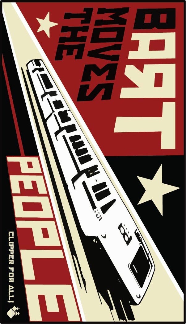
By K. Christopher Howse
“While I was designing this card, BART leadership and its employees hit a wall during their contract renegotiations. Neither side would relent, so the workers went on strike, bringing all BART trains to a halt. For days, 400K+ commuters (including my wife, a social worker who helps people in crisis) struggled for hours at a time trying to get from one side of the bay to the other. For me, this really underscored the importance of BART and its workers to this area. BART does and must move the people.”
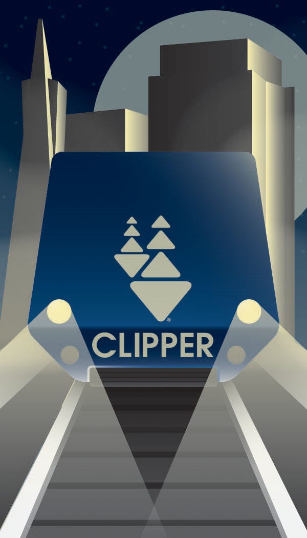
By Stella Lee
“The influence of Art Deco is prevalent in the architecture and design of the Bay Area. I wanted to highlight that influence while also keeping the Clipper card identity recognizable for the everyday user. I kept the Clipper card blue gradient as well as the iconic white-triangle sails and brought those two details into the geometric, high-contrast look of the Art Deco scenery.”
Photo courtesy of James Jordan.
The Bold Italic is a not-for-profit media organization, and we publish first-person perspectives about San Francisco and the Bay Area. We operate under a fiscal sponsorship of a 501(c)(3).
You can become a paid subscriber. Or donate. Or learn more about us.