
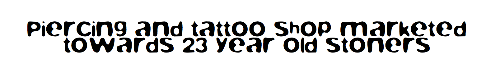
Tensions flared in the typography fandom when Saturday Night Live featured a sketch mocking the Papyrus typeface; in particular, its appearance in the title for James Cameron’s Avatar.
As a typography enthusiast, I must object to this round dismissal of Papyrus.ttf. Every typeface has its time and its place — even Papyrus. Even Wingdings. Yes, even Comic Sans. Sure, that time and place might be on the signage for a preschool in a suburban Wisconsin strip mall. But though coastal elites deny it, that is, indeed, a real place.
Hence, I’ve assembled a quick guide to much-loathed fonts accompanied by details as to what kinds of establishments may use them without being mocked. Break these rules at your own peril.
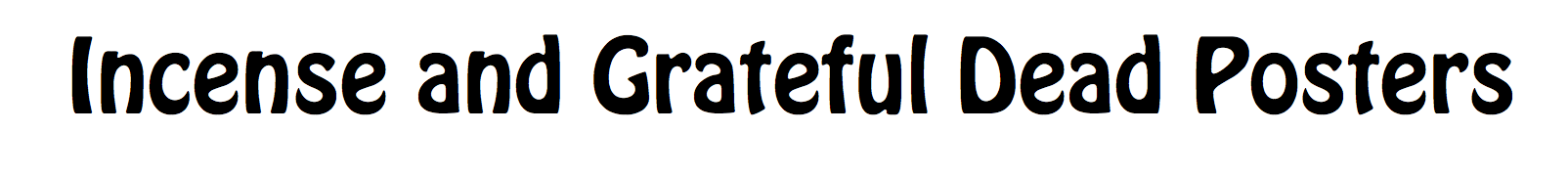
Amatic SC
Lobster
Fredericka the Great
Hobo
Pacifico
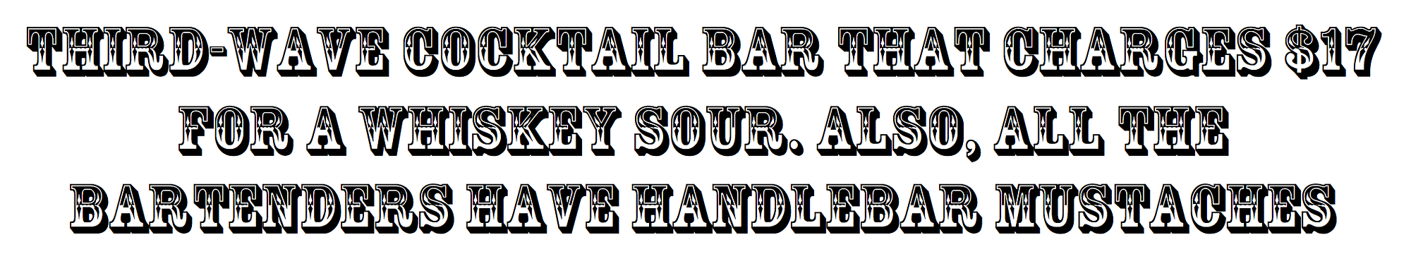
Rosewood Std Regular
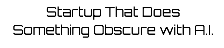
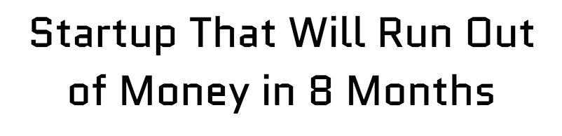
Orbitron
Blurfont
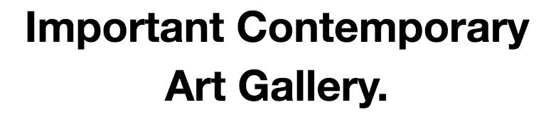
Helvetica Neue
Quantico
Allstar Regular
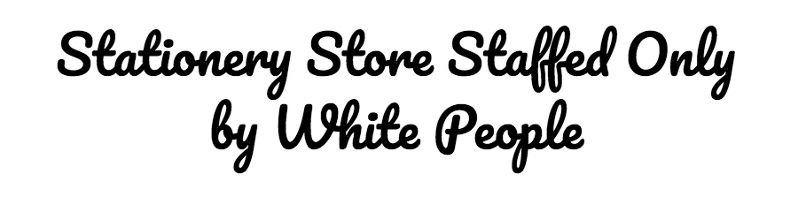
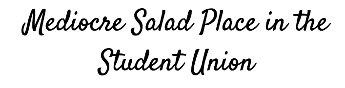
Satisfy
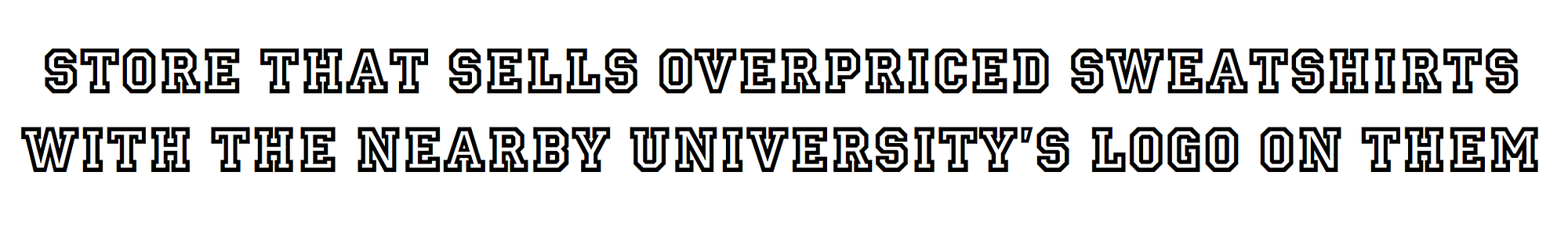
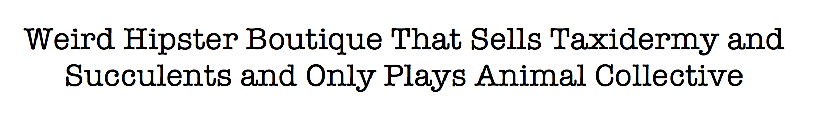
American Typewriter
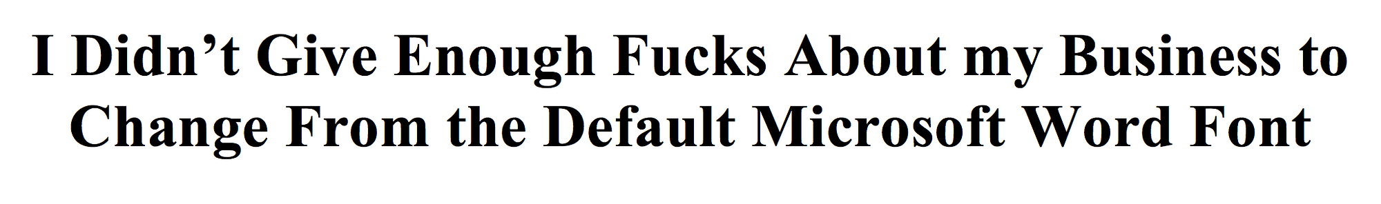
Times New Roman
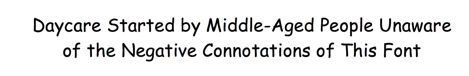
Comic Sans
[Update! Apparently I missed some of the most-despised fonts, so you can read the thrilling follow-up by clicking here].
The Bold Italic is a not-for-profit media organization, and we publish first-person perspectives about San Francisco and the Bay Area. We operate under a fiscal sponsorship of a 501(c)(3).
You can become a paid subscriber. Or donate. Or learn more about us.